Stop! Before you pick up that paintbrush or browse another catalog, ask yourself: Is my home reflecting my personality or just a generic showroom?
Did you know that the wrong color combination can make a room feel 20% smaller and significantly more stressful? In 2026, we are moving away from boring "all-white" apartments toward soulful, vibrant, and grounded spaces. Here are the 4 color palettes that are taking Thane by storm this year.
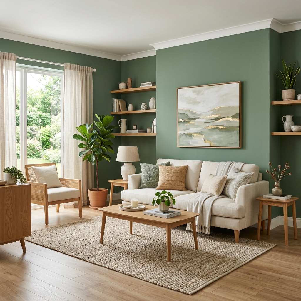
The Forest Sanctuary
Perfect for creating a "wellness zone" in your living room. Sage green acts as a calming base, while oak wood textures bring in warmth.
The Modern Heritage
A bold nod to Indian roots. Terracotta provides a rustic, energetic vibe that is balanced perfectly by off-white and premium brass accents.
🎨 Color Psychology Hook
Colors aren't just for looks. Blue lowers blood pressure, Green reduces eye strain, and Terracotta stimulates conversation. Choose your palette based on how you want to feel in the room, not just how it looks on Instagram.
The Urban Zen
Best for bedrooms and home offices. The muted blue promotes focus and deep sleep, while slate provides a sophisticated, modern anchor.
The Desert Sunset
The ultimate "Warm Minimalism" palette. Clay brown and beige create a monochromatic depth that feels incredibly expensive and high-end.
How to Test Your Colors?
Thane's lighting is unique. Between the heavy monsoon clouds and the bright summer sun, a color that looks great in a showroom might look dull in your flat. We always recommend 2ft x 2ft sample patches on your actual walls. Observe them at 10 AM, 4 PM, and under your evening LED lights before committing.
📌 Final Tip: Follow the 60-30-10 rule. 60% dominant color, 30% secondary color, and 10% accent color for a perfectly balanced room every time.